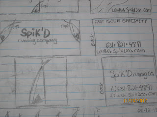
Above is my letterhead and business card. I took my logo design from illustrator and placed it into the InDesign program. My original logo's name, "Spik'D" was a different font before. I decided to change it to Arab Brushstroke D because the original font look to mechanical. I decided to keep all the words/writings the same font, with different features. I went with the cyan blue again because most tracks have this type of color. For the letterhead I used illustrator to design track lanes for the corners of the paper. I used the image below to guide me.
I incorporated the logo too, but small and above the address and contact information. I feel like it balances out the paper.
Below is my tri-fold brochure.
The first page I wanted to make simple and attractive so I just put the name of the company and the logo. I placed both images in via illustrator. When you open the brochure you see a quote from the famous runner Steve Prefontaine.
I placed the track image in the left corner to make use of the negative space. The middle page is the "About Us" section. It describes what the company is and what it wishes to accomplish. I used the same cyan blue for the banner but lowered the transparency so it would be easier to read the black font within. I placed another quote from Steve below the paragraph. Lining up the font took me some time, I didn't want to have any hyphenated words. To the left of the middle page is "Our Products." I broke up the paragraph into two smaller ones so the reader doesn't get lost in the words. Yet another quote was added above the track. I lowered the transparency of the track to about 50% on both pages so you could see the quote more clearly. The other side of the brochure explains the company's expertise on running. the same font, Arab Brushstroke D was used.
The back of the brochure displays the contact information. I wanted to make it a little larger than the rest of the brochures font because it really is the most important information. I wrote out the address in illustrator so I could include the cyan blue lines in the company name.
In the end, I'm satisfied with my final project. I really enjoyed working on it, perhaps because I had a better understanding of all the programs that we used throughout the semester. I had to test print many times to fix the alignment of the brochure and get it just right. I went to UPS to print out the final documents. I was upset that they only had one type of paper however.


