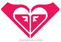
1. When this brand first came out I honestly thought the logo was stupid. But soon enough I feel in love with the brand. This logo is effective because it is so different yet simple. It's just two half circle lines put together but can fit perfectly on any equipment, apparel, or accessory of the brand. The targeted audience is athletic people. The logo does successfully reach this type of audience with its tough,almost masculine like features. This logo is always depicted in black, which makes it easy to place on different colored products.
2. This logo is very popular because it correlates with not just one, but two brands. The one above is Roxy and when you take off one half of the logo it is the quicksilver logo. Therefore, it is very memorable. The logo almost resembles a heart, which is appealing to many girls and women. The design is unique and original. The color of the logo varies from time to time to different colors.
3. The Hollister bird can be seen everywhere. Even though this logo usually always contains the brands name under it, it is still widely recognized as Hollister if you just see the bird on its own. The bird is a universal symbol but for this brand, which is beachy, is an appropriate icon. The target audience is young teens- to mid twenties and accomplishes that with its beach bird. It also has a high usability due to the fact that the bird can be shrunk or enlarged easily due to its simplicity.
4. The Target logo seems to be everywhere these days. The commercials are able to incorporate this logo through everyday objects featured in their commercials. They used to have the Target dog as their icon but changed to this one because it has more usability, in my opinion. They even sell their own products in their stores with this logo planted on them. The circles are memorable and is a timelessness symbol. The red color pops and grabs the attention of Target's wide audience.
5. The MTV logo has been around for what seems like decades. Therefore it is very memorable and the durability is high. Even though this television station doesn't really play music anymore, the icon is still the same(except it usually doesn't have the words "music TV" under it. The simple big M and TV have a good visibility even though not many products are made from within this company. This logo also ranges from color to color, without a set one. The black color above, however is simple and efficient in reaching the young and young adult age range.


No comments:
Post a Comment